
Sometimes you have a photo that’s technically fine, but the colors look weird: a face that’s too yellow, a sky that’s too gray, an indoor scene that’s too orange, or shadows that are a bit bluish. In many cases, the problem isn’t exposure—it’s white balance.
Good news: this setting is much less complicated than it looks. Once you understand what it does, you quickly spot why an image looks dull, too warm, or too cool. And you also know what to fix—both when shooting and in editing.
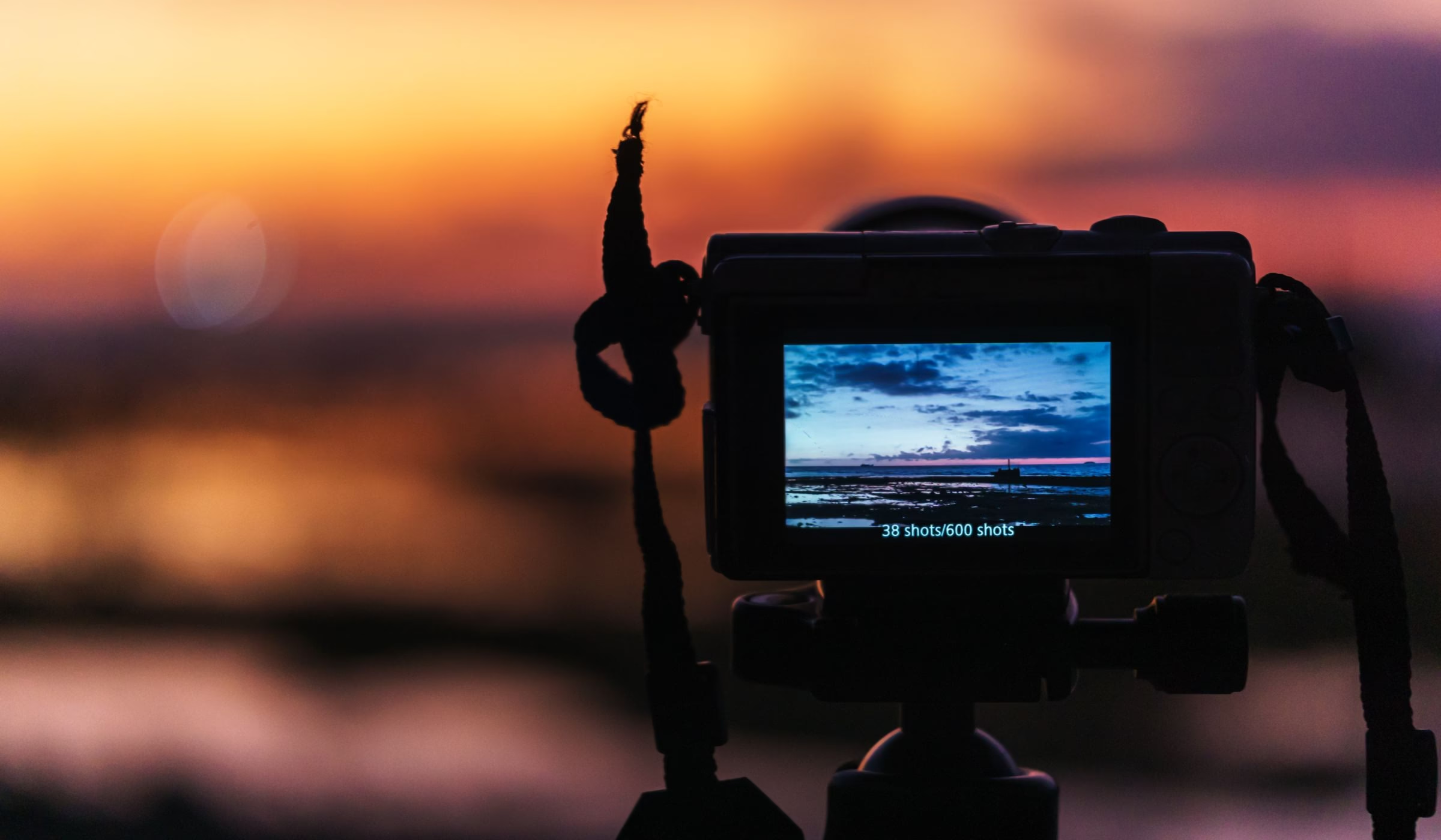
What exactly is white balance?
White balance is used to make colors look more natural based on the light present. A tungsten bulb, an overcast sky, a sunset, or outdoor shade don’t light a scene the same way. So the camera tries to interpret that light so that white looks white—and the rest of the colors follow in a believable way.
In practice, we often talk about a warm look when the image shifts toward yellow or orange, and a cool look when it shifts toward blue. White balance doesn’t change sharpness or depth of field: it mainly affects the photo’s overall color mood.
If you’re just starting out, the easiest way is to see this setting as a complement to the exposure triangle. Exposure controls the amount of light. White balance controls the color of that light.
Why do some photos look too yellow, too blue, or too dull?
The most common case is indoors lit by warm lamps. If the camera doesn’t compensate enough, the whole image can turn orange. Conversely, outdoors in shade or under an overcast sky, poorly interpreted white balance can produce a bluer, duller look than what you perceived on location.
- Indoors: yellow or orange cast.
- In shade or at sunrise: blue cast.
- Under mixed lighting: inconsistent tones from one area to another.
- Poorly handled auto: a technically clean image, but without real color consistency.

A photo can also look dull without being truly bad. Often, the ambient light was interesting, but the camera tried to neutralize it completely. Result: you lose either the warm mood of a sunset or the freshness of a morning scene. So the right setting isn’t always the one that “fixes everything,” but the one that respects what you wanted to show.
Auto, daylight, shade, cloudy: which setting should you choose in the field?
Auto white balance works very well in many simple situations. For everyday photography, it already prevents a lot of mistakes. But as soon as the light gets unusual, it can hesitate or smooth out the mood.
- Auto: handy if the light changes quickly.
- Daylight: useful for keeping a stable look in full sun.
- Cloudy: slightly warms up a scene that feels a bit flat.
- Shade: compensates for a cool cast outdoors.
- Tungsten / incandescent: useful indoors under warm light.
A good habit is to check whether the scene is lit by one dominant source or by several different sources. If everything comes from the same light, a simple preset is often enough. If you’re mixing a blue window, an orange lamp, and ceiling lighting, it becomes harder to get perfect color everywhere.
The quality of the light itself matters a lot. If you want to improve on this, our article on natural light helps you better anticipate the moments when colors naturally become more flattering.
Quickly fix a color cast without overcomplicating things
If your images are often a bit too yellow, too cool, or lack balance, Luminar Neo makes it easy to adjust temperature, tint, and the overall look. The code BLI10 gives you 10% off.
When should you correct while shooting, and when is it better to wait for editing?
If you shoot in JPEG, it’s best to try to get it fairly right from the start. The file leaves less room for big corrections later. If you shoot RAW, you keep more latitude to adjust color temperature without degrading the image.
But even in RAW, it helps to have a clear intention. For example, a sunset doesn’t need to be “whitened” at all costs. Conversely, an indoor portrait can quickly look unhealthy if the skin turns too orange or greenish. So the idea isn’t to neutralize everything, but to keep a believable, pleasing look.
If your image already lacks precision or stability, fix the basics before editing too. Our tips for getting sharp photos are still useful, because nice color won’t save a blurry photo.

How do you correct white balance without making the photo look artificial?
The classic editing trap is going too far. You cool down a warm image until it turns gray, or you warm up a dull scene until skin tones turn orange. The simplest approach is to adjust in small steps.
- Start with temperature to correct the overall look.
- Then adjust the tint if the image leans slightly toward green or magenta.
- Check neutral areas: a white wall, gray clothing, a light table, clouds.
- Dial it back if the natural mood disappears completely.
A well-balanced image isn’t necessarily perfectly neutral. An interior can stay a bit warm; an end-of-day scene, a bit golden. What matters is that the result feels intentional, not accidental. To go further on an image’s overall consistency, you can also revisit the basics of photo composition: a photo often feels stronger when colors, light, and framing all tell the same story.
If you’re looking for a simple tool for this kind of adjustment, our article on Luminar Neo and our guide to a smoother photo workflow can help you save time without getting lost in the settings.
A simple exercise to finally understand this setting
- Shoot the same scene in auto mode, then with the daylight, cloudy, and shade presets.
- Test it both outdoors and indoors.
- Compare the whites, skin tones, and overall mood.
- Choose the image that feels closest to what you wanted to convey—not just the most “neutral.”
This small test is often enough to make it click. You quickly discover that white balance isn’t just a technical setting hidden in a menu: it’s a tool that directly influences how a photo feels.
In short
If your photos look too yellow, too blue, or a bit dull, think about white balance first. Understanding light, choosing the right preset, and making a slight correction in editing is often enough to transform the result. No need for complicated jargon: you mainly need to learn to spot when color supports your image—and when it gets in the way.
Want cleaner, more consistent color?
To easily correct temperature, tint, and overall harmony without a complicated workflow, Luminar Neo is still a very accessible option. The code BLI10 gives you 10% off.
Visuals: Pexels (Nothing Ahead, George Milton, Nur Demirbaş).








Leave a Reply